01. Context
NORDEN needed a visual identity for a very specific audience: leaders and senior professionals whose authority is communicated through restraint, not display. The challenge was not to sell warmth or spa-like comfort, nor to fall into the gilded ostentation typical of the premium cosmetics sector, but to translate quiet, understated luxury into a cold, clinical, almost architectural tone — precision as the ultimate form of prestige.
02. Approach
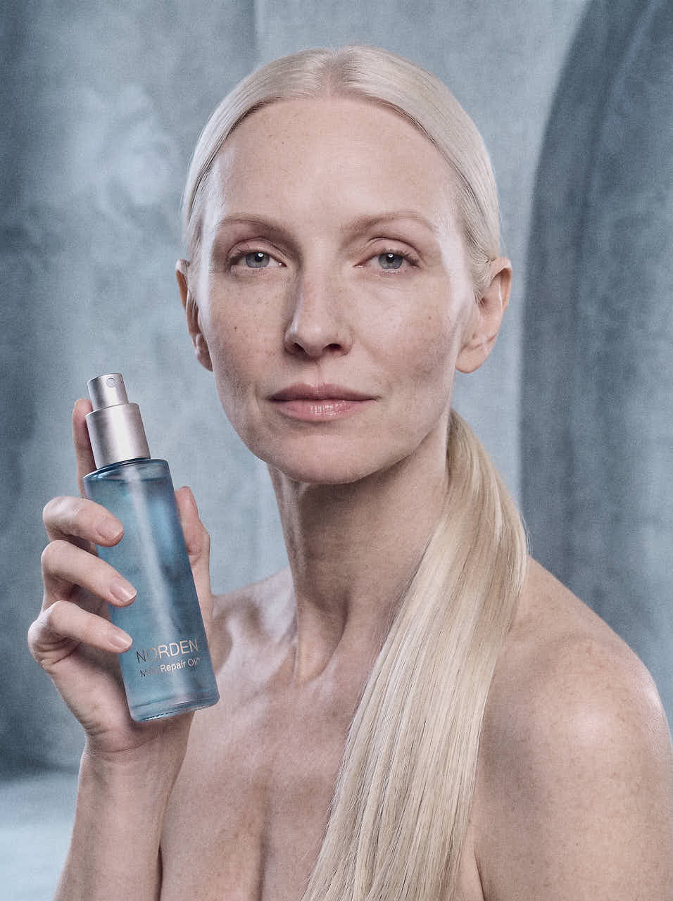
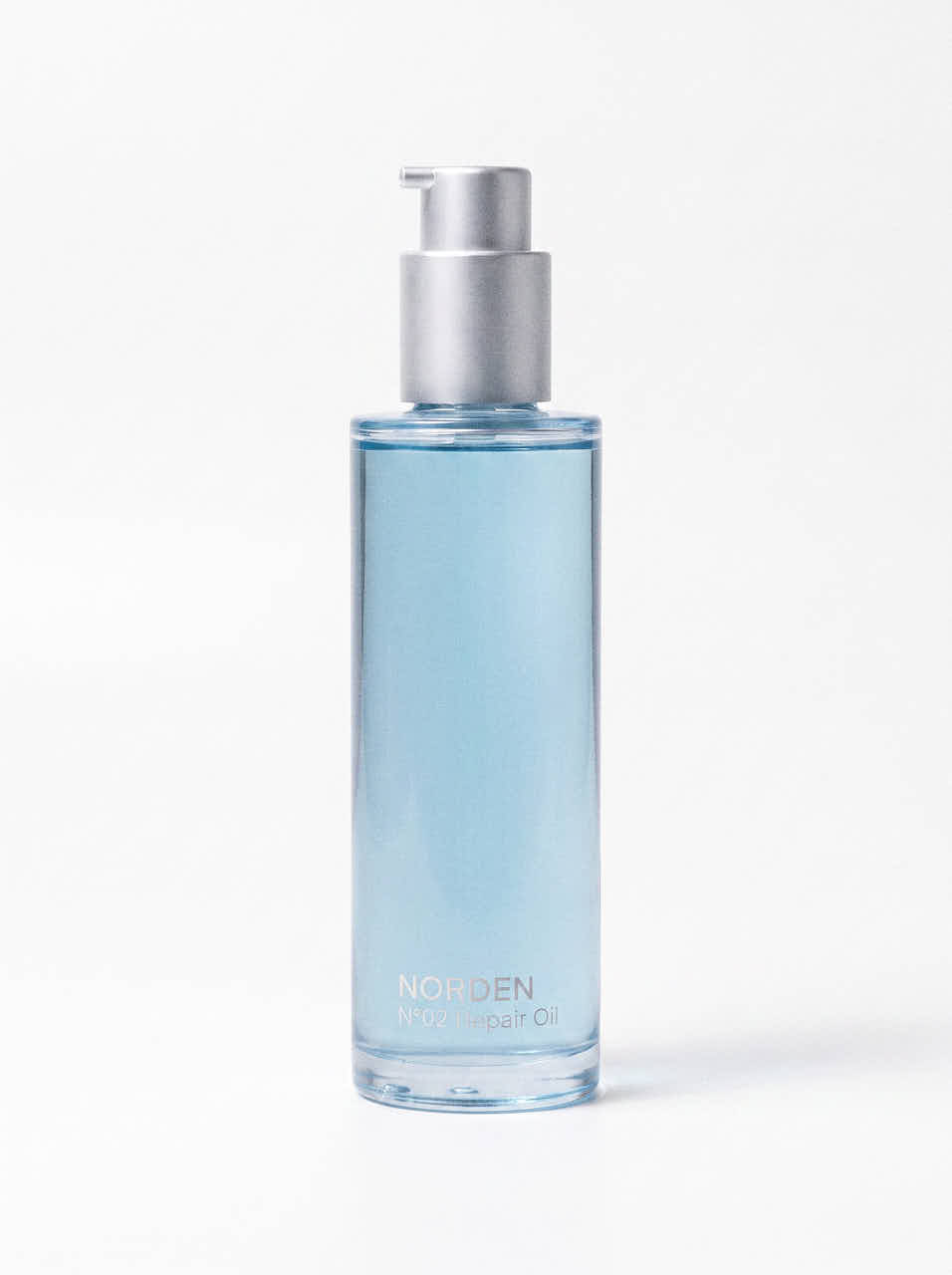
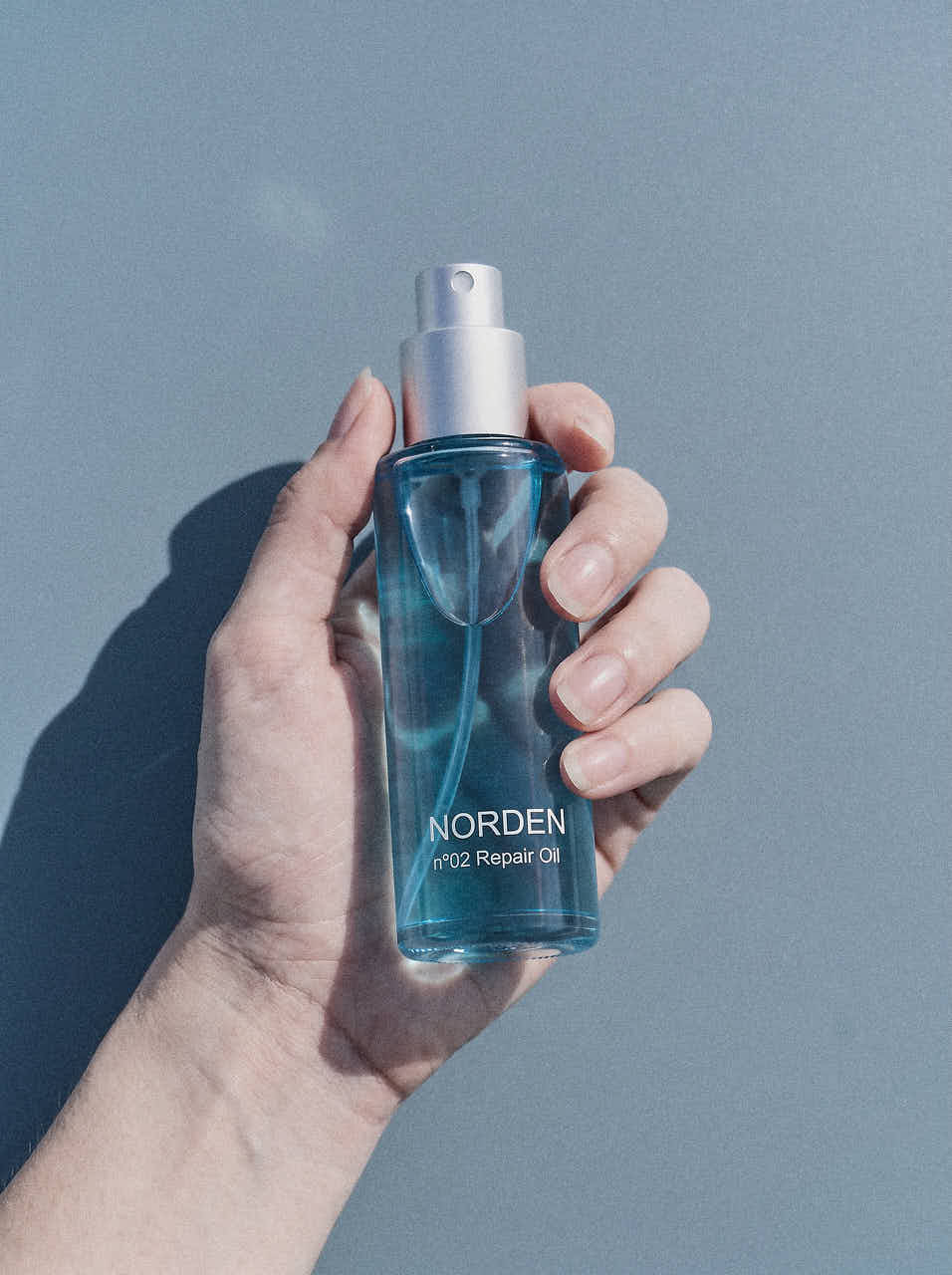
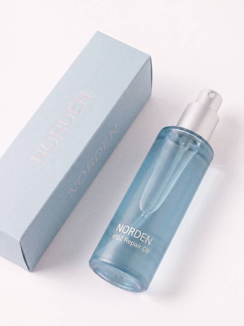
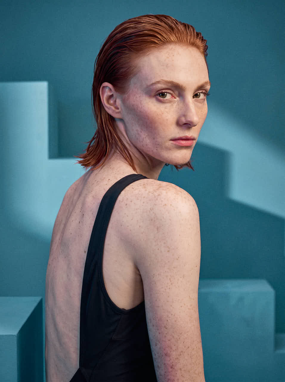
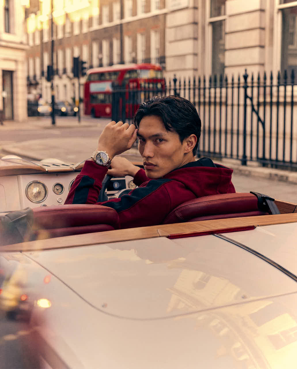
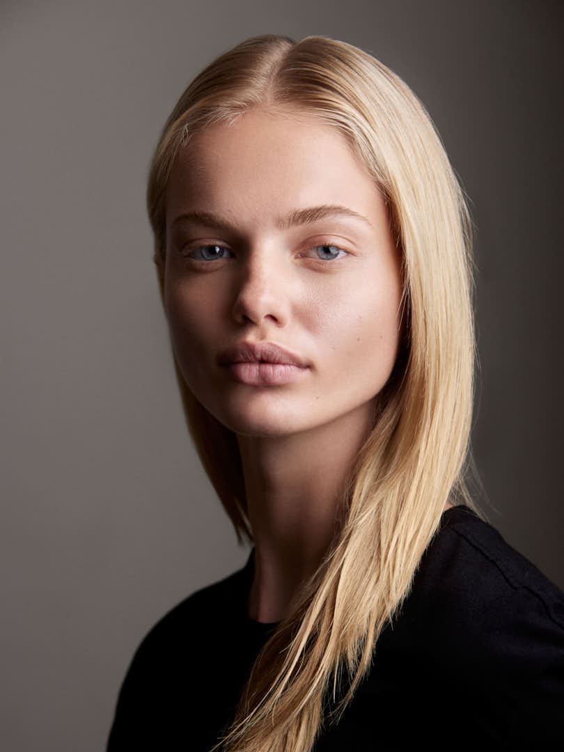
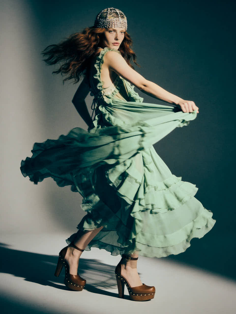
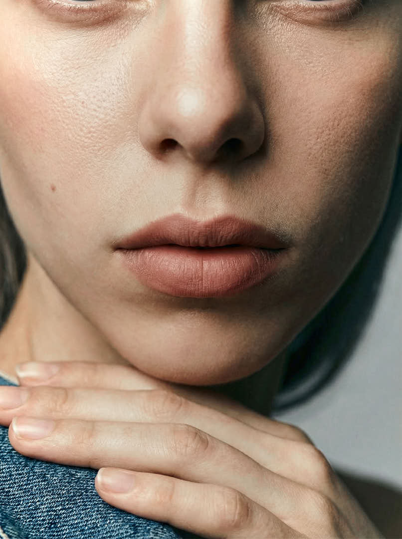
I developed a three-layered visual system — product, gesture, and texture — with a palette built on glacial blues, muted moss green, graphite, and brushed metal, reserving a single warm accent exclusively for the makeup line. Lighting and set design favored hard, directional cold light and geometric, architecture-inspired environments over soft or atmospheric staging. Every material choice — frosted glass, brushed aluminum, unbleached paper — was treated with the same discipline across all three lines, so the collection reads as one coherent brand system rather than a set of isolated photographs.
03. Outcome
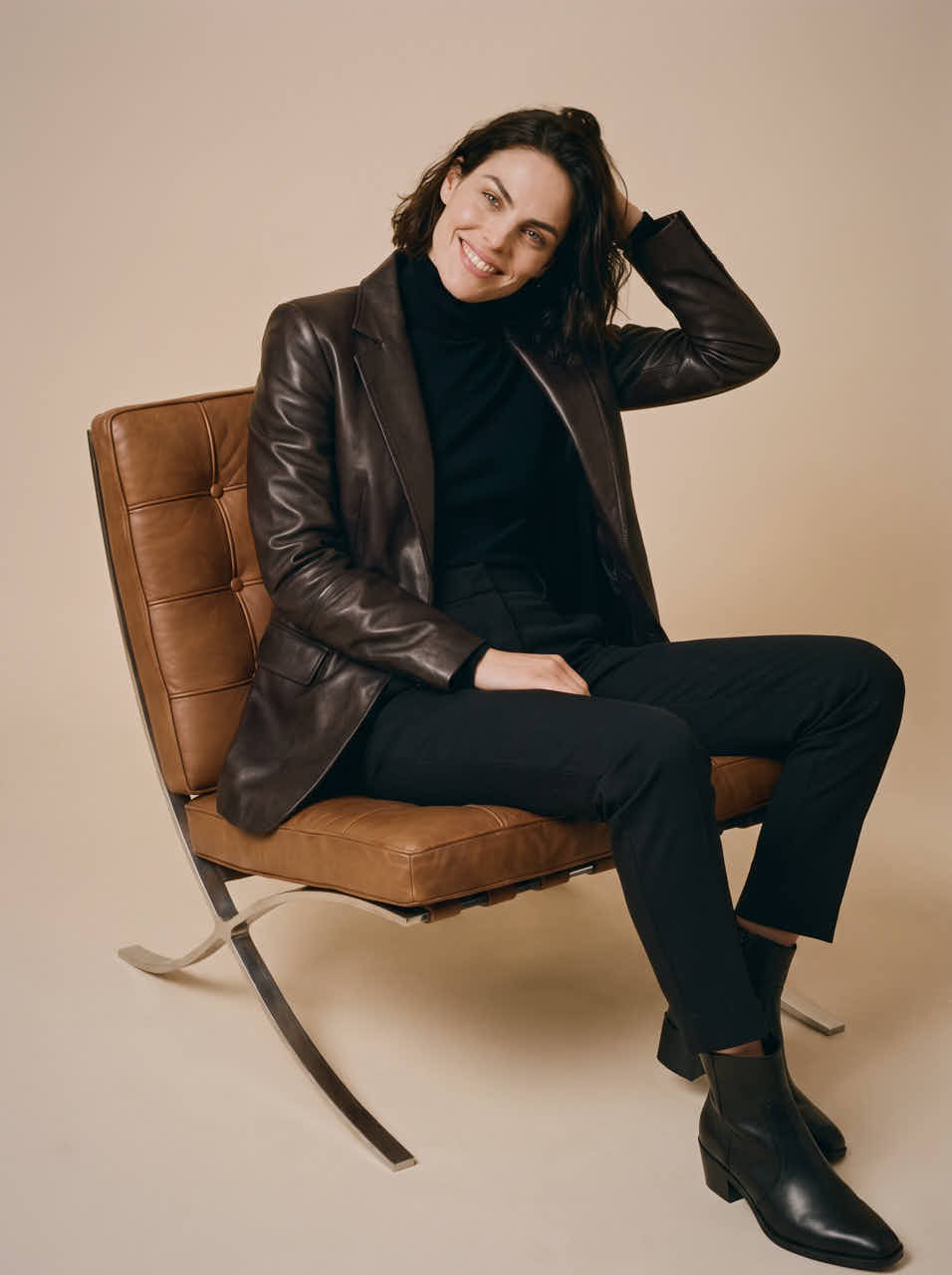
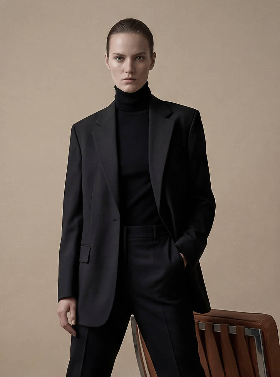
The result is a set of images that sustain the brand’s promise without needing text: the coldness of the light, the discipline of the composition, and the near-total absence of ornament communicate authority rather than mere aesthetics. A case study that demonstrates how to translate a premium, understated positioning into concrete photographic and packaging decisions — replicable for real clients across corporate, agency, and executive-branding contexts.
01. Contexto
NORDEN necesitaba una identidad visual dirigida a un público muy específico: líderes y profesionales de alto nivel cuya autoridad se transmite a través de la sobriedad, no de la ostentación. El reto no consistía en vender calidez o comodidad propia de un spa, ni caer en la ostentación dorada típica del sector de la cosmética de lujo, sino en plasmar el lujo discreto y sobrio en un tono frío, clínico, casi arquitectónico, donde la precisión es la forma definitiva de prestigio.
02. Enfoque
Desarrollé un sistema visual de tres capas —producto, gesto y textura— con una paleta basada en azules glaciales, verde musgo apagado, grafito y metal cepillado, reservando un único toque cálido exclusivamente para la línea de maquillaje. La iluminación y el diseño de los decorados favorecieron una luz fría, dura y direccional, así como entornos geométricos inspirados en la arquitectura, en lugar de una puesta en escena suave o atmosférica. Cada elección de material —cristal esmerilado, aluminio cepillado, papel sin blanquear— se trató con la misma disciplina en las tres líneas, de modo que la colección se percibe como un sistema de marca coherente en lugar de un conjunto de fotografías aisladas.
03. Resultado
El resultado es un conjunto de imágenes que mantienen la promesa de la marca sin necesidad de texto: la frialdad de la luz, la disciplina de la composición y la ausencia casi total de adornos transmiten autoridad más allá de la mera estética. Un caso práctico que demuestra cómo plasmar un posicionamiento premium y discreto en decisiones concretas sobre fotografía y packaging, replicables para clientes reales en contextos corporativos, de agencia y de marca ejecutiva.